Card builder
Lay out the deck card by card, check it, preview it as the glasses show it, and publish it.
The card builder is where the deck takes shape. Each card is one screen on the glasses: you place your pictures on it, add words and boxes, and put the cards in order.
It opens from Card builder on a manual in the studio, from Continue to card builder in the asset library, or on its own when you start a manual as custom cards.
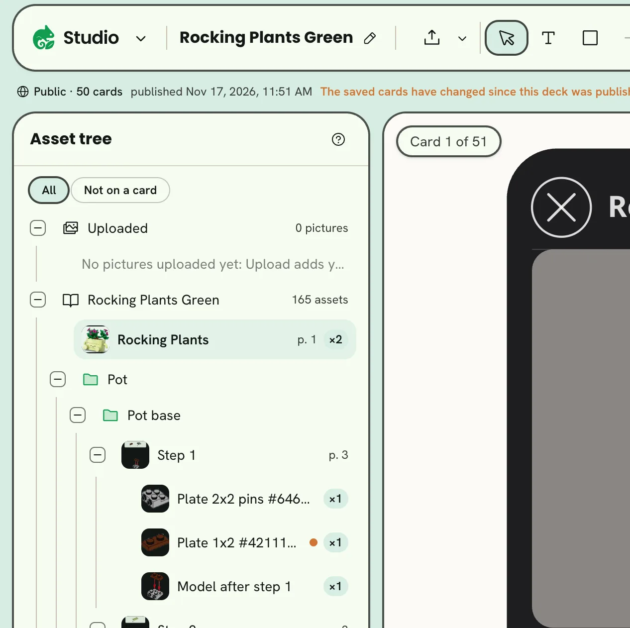
- 1Tools
- 2Asset tree
- 3The card
- 4Zoom and Fit
- 5The deck
- 6Preview
- 7Publish
- 8What's published
- The asset tree lists your uploaded pictures, then every built asset by group and step, each with how many cards use it. Not on a card shows only the ones you haven't placed yet.
- The card in the middle is drawn as the glasses draw it. The glasses add light to what the wearer sees, so black is clear.
- The zoom pill under the card zooms out and in, and Fit brings the whole card back into view. The scroll wheel zooms too, and dragging the empty space around the card moves the view.
- The deck shows every card in order.
- Under the top bar, a line says what's published, and whether the saved cards have changed since.
The tools

- 1Upload
- 2Select
- 3Text
- 4Box
- 5Place
- 6Arrange
- 7Duplicate
- 8Delete
| Tool | What it does |
|---|---|
| Upload | Adds pictures of your own, which appear under Uploaded in the tree. |
| Select | Click things on the card to select them. |
| Text | Adds a text at the card's center. |
| Box | Adds a box, to sit behind words or group things on the card. |
| Place | Places the asset chosen in the tree on the card. |
| Arrange | Brings what's selected forward or back, and turns it a quarter turn. |
| Duplicate, Delete | Copy or remove what's selected. |
The bar shows the tools' names where it has room for them, and their icons alone where it has not, as in the picture at the top of this page.
Place a picture
Drag an asset from the tree onto the card, or choose it and click Place on card. The card at the foot of the tree shows the asset, where it came from, and how many cards already use it.
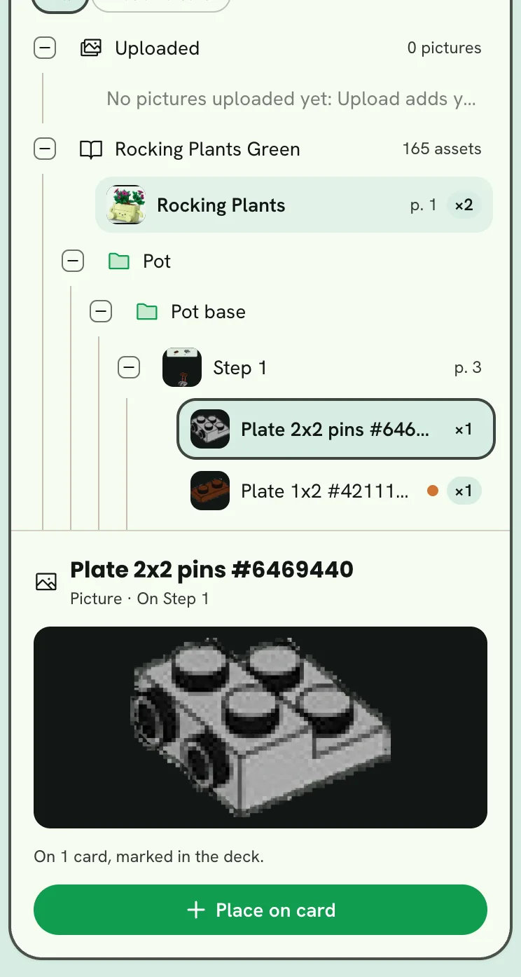
- 1Choose an asset
- 2Place on card
Change what's on the card
Click something on the card to select it, or Shift-click to select more than one; on a touch screen, Select several beside Select does what Shift does. Then:
- Drag it to move it; guides show when it lines up with other things.
- Drag a handle to resize it. Shift frees a picture's proportions. A text's side handles set its width, and its corners scale the type.
- Drag the round handle to turn it. It snaps to quarter turns, and Shift turns in steps.
- Double-click a text to type on the card.
The card at the foot of the tree shows what you can set for the selected thing.
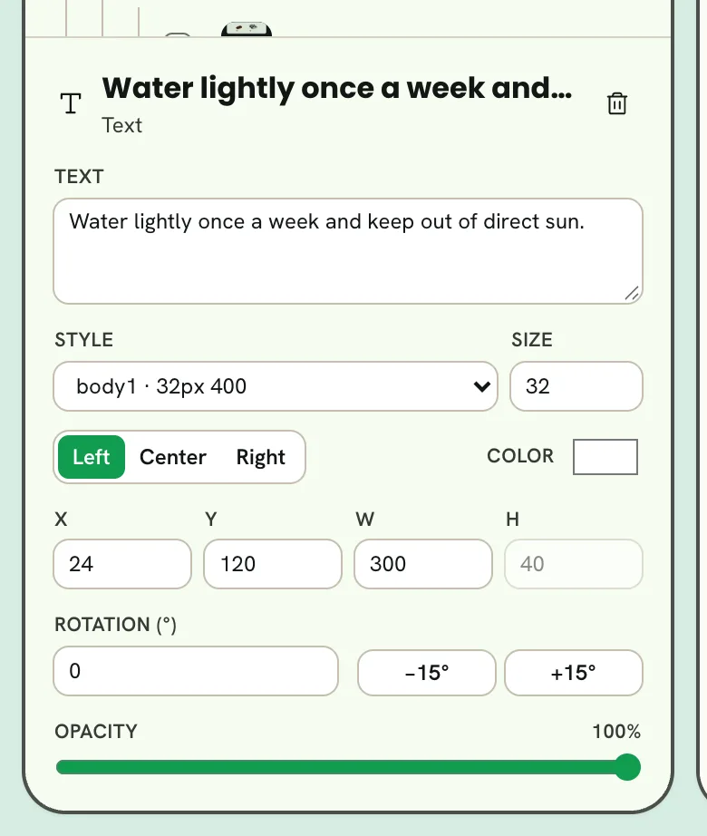
- 1Style
- 2Size
- 3Place and size
- 4Rotation
- 5Turn by 15°
- A text has its words, Style, Size, alignment and color.
- A box has its color and corner radius.
- Everything has its place and its size, typed as X, Y, W and H in the card's pixels. A picture keeps its proportions, and a text's height follows its lines.
- Everything has Rotation, with −15° and +15° beside it to turn it a step at a time, and opacity.
- With nothing selected, the card itself can take a Card fill color.
Arrange the deck
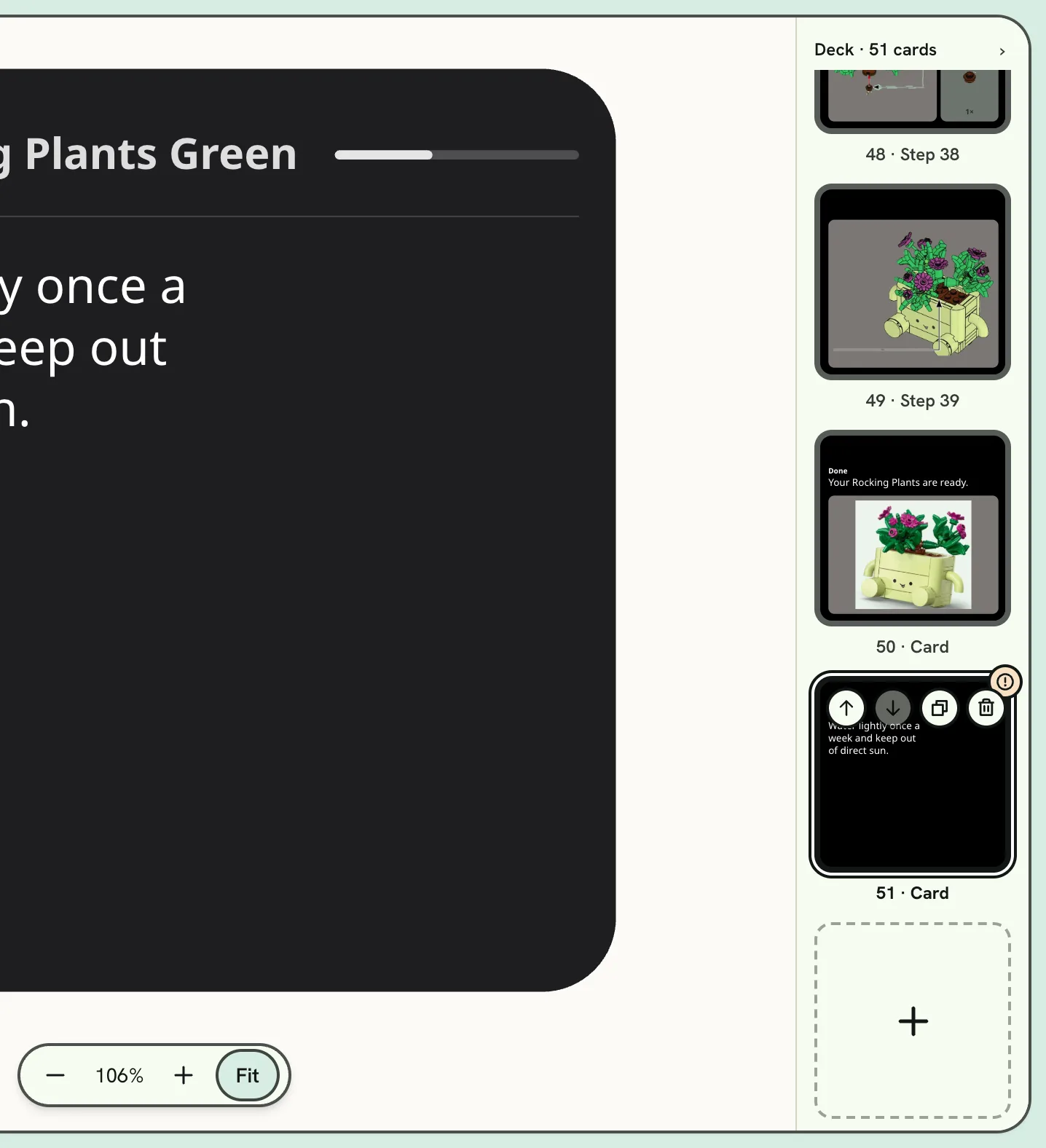
- 1The card being edited
- 2Its buttons
- 3Add a card
- Click a card to edit it.
- Drag cards to put them in order.
- The card you're editing has four buttons on its corner: move earlier, move later, duplicate and delete. Another card shows them under the pointer.
- Add a card puts a new one after the card you're editing.
- A card with something to look at has a warning mark.
- › hides the deck, and ‹ Deck beside the zoom pill brings it back.
Check the deck
The issues pill in the top bar counts what the checks found. Open it for the list:
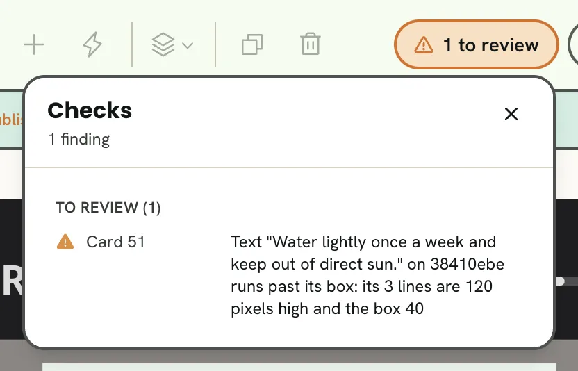
- 1What the checks found
- 2A finding
- Blocks a publish: must be fixed before you can publish.
- To review: may be what you meant, so look and decide.
Click a finding to go to its card and select what it's about.
Preview on the glasses
Preview opens the saved deck in a new tab, as the glasses show it, on the card you're editing. Save first to see your latest changes.
Publish
Publish sends the saved deck to the glasses.
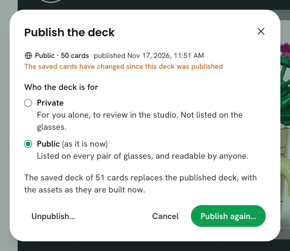
- 1Private: for you, in the studio
- 2Public: on every pair of glasses
- Private is for you alone, to review. It isn't listed on the glasses.
- Public lists the deck on every pair of glasses, readable by anyone.
If you have unsaved changes, the dialog asks you to save them first, and it lists anything that blocks a publish. Once a deck is published, the same dialog publishes it again, moves it between private and public, or unpublishes it.
Keys
| Key | Does |
|---|---|
| Arrows | Nudge what's selected (Shift: further) |
| ⌥→, ⌥← | Turn what's selected by 15° |
| ⌘D | Duplicate |
| Delete | Remove what's selected |
| ⌘], ⌘[ | Bring forward, send backward (with ⌥: to front, to back) |
| Esc | Clear the selection |
| ⌘Z, ⇧⌘Z | Undo, redo |
| ⌘S | Save |